If you dig a little, there’s no shortage of recommendation methods. The question is, which model to choose. One of the primary decision factors here is quality of recommendations. You estimate it through validation, and validation for recommender systems might be tricky. There are a few things to consider, including formulation of the task, form of available feedback, and a metric to optimize for. We address these issues and present an example.
Recommendation as ranking
We approach recommendation as a ranking task, meaning that we’re mainly interested in a relatively few items that we consider most relevant and are going to show to the user. This is known as top-K recommendation.
Contrast this with rating prediction, as in the Netflix competition. In 2007, Yehuda Koren - a future winner of the contest - noted that people had doubts about using RMSE as the metric and argued in favor of RMSE, using an ad-hoc ranking measure. Later he did the same thing in the paper titled Factorization Meets the Neighborhood [PDF].
There’s only a small step from measuring results with RMSE to optimizing RMSE. In our (very limited) experiments, we found RMSE a poor loss function for ranking. For us, matrix factorization optimized for RMSE did reasonably well when ordering a user’s held-out ratings, but failed completely when choosing recommendations from all the available items.
We think the reason is that the training focused on items with the most ratings, achieving a good fit for those. The items with few ratings don’t mean much in terms of their impact on the loss. As a result, predictions for them will be off, some getting scores much higher, some much lower than actual. The former will show among top recommended items, spoiling the results. Maybe some regularization would help.
In other words, RMSE doesn’t tell a true story, and we need metrics specifically crafted for ranking.
Ranking metrics
The two most popular ranking metrics are MAP and NDCG. We covered Mean average precision a while ago. NDCG stands for Normalized Discounted Cumulative Gain. The main difference between the two is that MAP assumes binary relevance (an item is either of interest or not), while NDCG allows relevance scores in form of real numbers. The relation is just like with classification and regression.
It is difficult to optimize MAP or NDCG directly, because they are discontinuous and thus non-differentiable. The good news is that Ranking Measures and Loss Functions in Learning to Rank shows that a couple of loss functions used in learning to rank approximate those metrics.
NDCG
Intimidating as the name might be, the idea behind NDCG is pretty simple. A recommender returns some items and we’d like to compute how good the list is. Each item has a relevance score, usually a non-negative number. That’s gain. For items we don’t have user feedback for we usually set the gain to zero.
Now we add up those scores; that’s cumulative gain. We’d prefer to see the most relevant items at the top of the list, therefore before summing the scores we divide each by a growing number (usually a logarithm of the item position) - that’s discounting - and get a DCG.
DCGs are not directly comparable between users, so we normalize them. The worst possible DCG when using non-negative relevance scores is zero. To get the best, we arrange all the items in the test set in the ideal order, take first K items and compute DCG for them. Then we divide the raw DCG by this ideal DCG to get NDCG@K, a number between 0 and 1.
You may have noticed that we denote the length of the recommendations list by K. It is up to the practitioner to choose this number. You can think of it as an estimate of how many items a user will have attention for, so values like 10 or 50 are common.
Here’s some Python code for computing NDCG, it’s pretty simple.
It is important to note that for our experiments the test set consists of all items outside the train, including those not ranked by the user (as mentioned above in the RMSE discussion). Sometimes people restrict test to the set of user’s held-out ratings, so the recommender’s task is reduced to ordering those relatively few items. This is not a realistic scenario.
Now that’s the gist of it; there is an alternative formulation for DCG. You can also use negative relevance scores. In that case, you might compute the worst possible DCG for normalizing (it will be less than zero), or still use zero as the lower bound, depending on the situation.
Form of feedback
There are two kinds of feedback: explicit and implicit. Explicit means that users rate items. Implicit feedback, on the other hand, comes from observing user behaviour. Most often it’s binary: a user clicked a link, watched a video, purchased a product.
Less often implicit feedback comes in form of counts, for example how many times a user listened to a song.
MAP is a metric for binary feedback only, while NDCG can be used in any case where you can assign relevance score to a recommended item (binary, integer or real).
Weak and strong generalization
We can divide users (and items) into two groups: those in the training set and those not. Validation scores for the first group correspond to so called weak generalization, and for the second to strong generalization. In case of weak generalization, each user is in the training set. We take some ratings for training and leave the rest for testing. When assessing strong generalization, a user is either in train or test.
We are mainly interested in the strong generalization, because in real life we’re recommending items to users not present in the training set. We could deal with this by re-training the model, but this is infeasible for real-time recommendations (unless our model happens to use online learning, meaning that it could be updated with new data as it comes). Our working assumption will be using a pre-trained model without updates, so we need a way to account for previously unseen users.
Handling new users
Lack of examples is known as a cold start problem: a new visitor has no ratings, so collaborative filtering is of no use for recommendation. Only after we have some feedback we can begin to work with that.
Some algorithms are better suited to this scenario, some worse. For example, people might say that matrix factorization models are unable to provide recommendations for new users. This is not quite true. Take alternating least squares (ALS), for example. This method fits the model by keeping user factors fixed while adjusting item factors, and then keeping item factors fixed while adjusting user factors. This goes on until convergence. At test time, when we have input from a new user, we could keep the item factors fixed and fit the user factors, then proceed with recommendations.
In general, when a predicted rating is a dot product between user and item factors, we can take item factors and solve a system of linear equations to estimate user factors. This amounts to fitting a linear regression model. We’d prefer the number of ratings (examples) be greater than the number of factors, but even when it’s not there is hope, thanks to regularization.
The more, the better
Normally a recommender will perform better with more information - ideally the quality of recommendations should improve as a system sees more ratings from a given user. When evaluating a recommender we’d like to take this dimension into account.
To do so, we repeatedly compute recommendations and NDCG for a given user with one rating in train and the rest in test, with two ratings in train and the rest in test, and so on, up to a number (which we’ll call L) or until there are no more ratings in test. Then we plot the results.
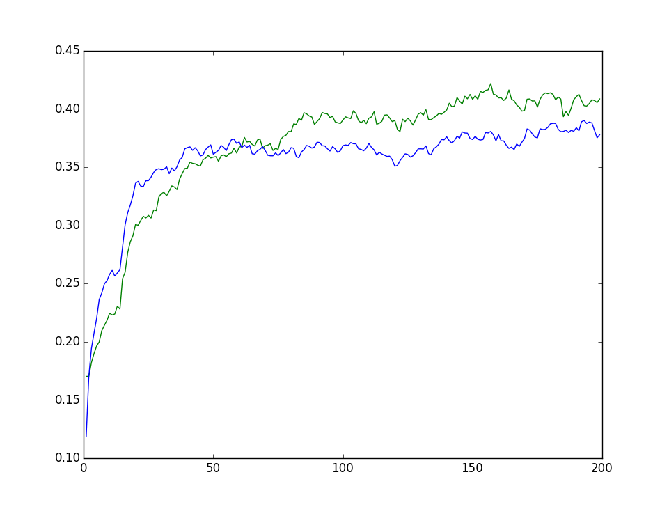
On the X axis, the number of ratings in train (L). On the Y axis, mean NDCG@50 across users.
When comparing results from two recommenders, the plot will reveal the difference between them. Either one is better than the other across the board, or at some point the curves intersect.
The intersection offers a possibility of using the combination of the two systems. Initially we employ the first; after acquiring more feedback than the threshold, we switch to the other. Here, blue is better when given a few ratings, but around 50 it levels off. Green gains an upper hand when provided with more ratings.
The scores were computed on a test set consisting of roughly 1000 users - this sample size provides discernible shapes, but still some noise, as you can see from jagged lines.
Should we require a number instead of a plot, we can average the scores across number of ratings available for training. The resulting metric is MANDCG: Mean (between users) Average (between 1…L) NDCG. You can think of it as being proportional to the area under the curve on the plot.
Code for this article is available on GitHub. To run it, you’ll need to supply and plug in your recommender.