Once again we beat the benchmark in a Kaggle competition. The goal of the contest at hand was to forecast mortality rate in England using Copernicus Atmosphere Monitoring Service data on air quality. Specifically, to forecast mortality caused by cancer and cardiovascular diseases. The competition represents the “in class” category, because the data is publicly available somewhere on the internets. Still, the winner got a Raspberry Pi.
The data consists of a few years’ worth of measurements from nine regions of England. Our first move was to split the training set in two parts for validation, then run gradient boosting and score the predictions. RMSE 0.29 - excellent, that would be top score on the leaderboard. Benchmark to beat is linear regression, scoring 0.33.
We had a hunch not to upload these predictions right away. Good hunch, because validation doesn’t quite work in this competition. We learned about this from a thread on the forum. Surfing the forum links, we found out that scikit-learn has functionality for building progressive validation set for time series. But that is not applicable here, because validation doesn’t work.
However, inspecting the content of the model selection module for other goodies, in the “Model validation” section we found an interesting piece: permutation test score.
Permutation test score
The function randomly permutes the labels, then trains a model and scores its predictions. After doing this enough times you build a sample and get a p-value.
Initially, we discovered that permuting the labels doesn’t change the validation score. That would suggest that the features are totally uninformative.
The thing is, that experiment was done on the spur of the moment in ipython, and we saved no code. Later we attempted to reproduce this result, but failed. It appears that validation works within the training set, after all. We adapted the example from the documentation for our permutation_test.py and ran 100 permutations.
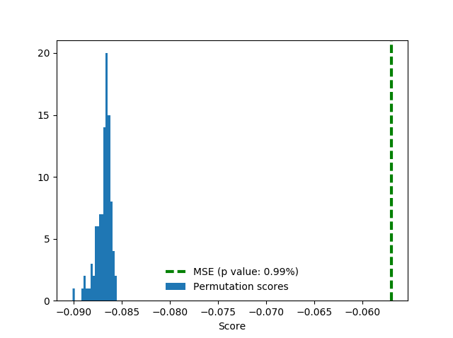
The score here is negative MSE (negative because the software is maximizing). Random permutations score around 0.29 in terms of RMSE, true labels in training significantly better (P value is 0.0099), around 0.24.
Note that we’ve used cross-validation here, which isn’t good practice for time series. Therefore, we run the test again with our own split:
train_i = d.date.dt.year < 2012
test_i = d.date.dt.year == 2012

# ...

score, permutation_scores, pvalue = permutation_test_score(
    clf, x, y, scoring = "neg_mean_squared_error",
    cv = [[ train_i, test_i ]],
    n_permutations = n_permutations )
Turns out that in this way we score even better, around 0.21. Notice how random permutation scores also got a little better.
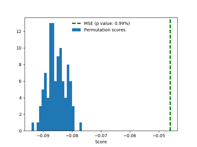
For good measure, here’s the same setup with addition of one-hot region features. These features do not help much but also don’t spoil the score.

Alas, validation scores do not translate into leaderboard scores.
Prophet
After the negative experience with validation we formed a suspicion that air quality features may be not quite sufficient for the task at hand. After all, we’d think that maybe people don’t die because today there’s more smog than yesterday, but rather from exposure over the years. This led us to forecast the target as 1-D time series, without additional features. We used the Prophet package from Facebook.
It works as follows: you give it a dataframe containing the date (ds) and target value (y) columns to fit, then it predicts yhat for a period in the future. The quick start offers a more detailed description of the process. Internally, the library employs two Stan models, which means you need Stan installed (good luck on Windows).
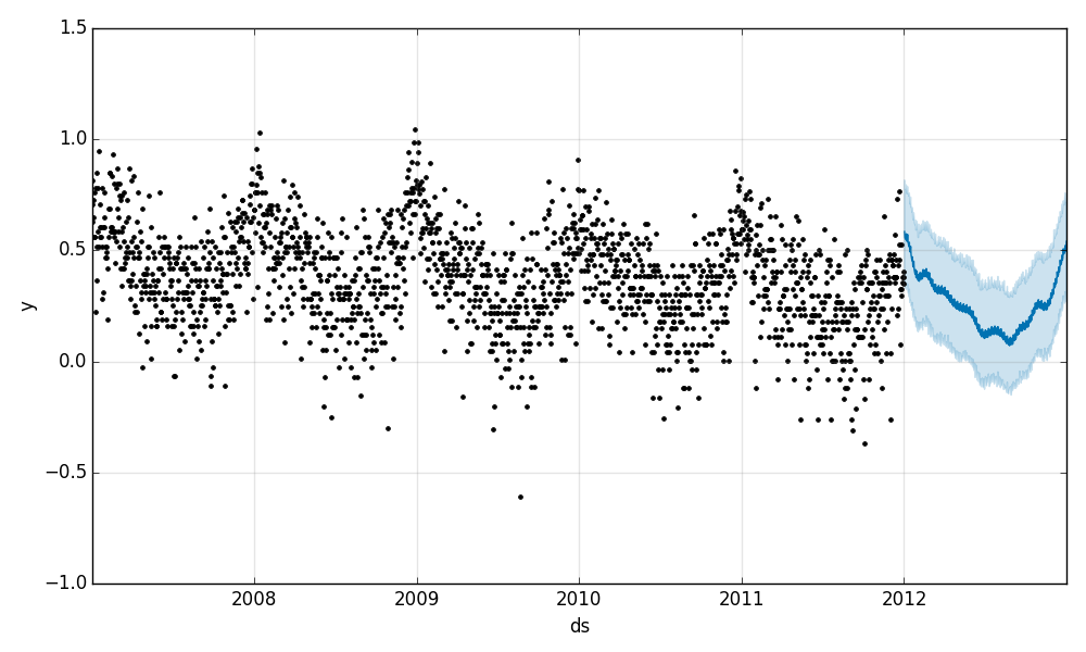
Prophet produced convergence in training, good validation scores, and nice plots. Unfortunately, as mentioned, validation doesn’t really work in this competition, so we’re left with the plots. As you can see, the prediction plot, although not accurate, looks very reasonable:
The components plot offers better information - there is a downward trend in mortality, and we see that mortality is seasonal. People die mostly in winter (around New Year), and on Mondays and Fridays.
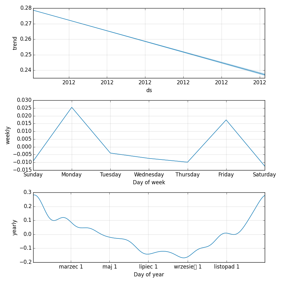
Prophet decided to print the names of the months in Polish, so this is your chance to learn: march, may, july, september (take care to pronounce that little box correctly), november.
Month and day-of-week features
This precious knowledge allowed us to improve on the linear benchmark by adding features based on date: month and day of week. Both are one-hot encoded, for a total of 12 + 7 = 19 new binary features.
train['day_of_week'] = train.date.dt.dayofweek
train['month'] = train.date.dt.month

test['day_of_week'] = test.date.dt.dayofweek
test['month'] = test.date.dt.month

# assuming that train and test sets have identical sets of values of categorical features
train = pd.get_dummies( train, columns = [ 'day_of_week', 'month' ])
test = pd.get_dummies( test, columns = [ 'day_of_week', 'month' ])
We don’t bother with validation this time, just go to the leaderboard, and into Top Ten.

Scaling the columns
When not using tree-based models, it usually makes sense to scale the columns. Here, the features have similar max. values, with the exception of T2M, which is slightly bigger.
O3                             96.284
PM10                           59.801
PM25                           45.846
NO2                            76.765
T2M                           297.209
Scaling the features with scikit-learn’s MinMaxScaler improves the public score by a tiny 0.00021. We chose this scaler for no particular reason other than that it leaves the one-hot columns as-is. In our experience, the differences between different scalers are minor and we find zeros and ones more aesthetically pleasing than shifted and standardized values.
Let’s inspect the feature weights:
In [20]: paste
coefs = zip( x_train.columns, lr.coef_ )
for c, i in sorted( coefs, key = lambda _: _[1] ):
        print "{:.1f} {}".format( i, c )

## -- End pasted text --

-1.4 NO2
-0.5 T2M
-0.3 O3
0.0 PM25
0.3 PM10
2421203389791.6 month_8
2421203389791.6 month_7
2421203389791.6 month_9
2421203389791.7 month_6
2421203389791.7 month_11
2421203389791.7 month_10
2421203389791.7 month_5
2421203389791.8 month_3
2421203389791.8 month_4
2421203389791.8 month_2
2421203389791.9 month_12
2421203389792.0 month_1
5373781166879.9 day_of_week_6
5373781166879.9 day_of_week_5
5373781166880.0 day_of_week_3
5373781166880.0 day_of_week_2
5373781166880.0 day_of_week_0
5373781166880.0 day_of_week_1
5373781166880.0 day_of_week_4
Looks like day of week and month are infinitely more important than other features. Interestingly, the weights within each group are almost the same. What if we use month and day of week as only features?

Ayayay! The code is available at GitHub.
What did not work
Since we’re scaling, we can now throw in the year as a feature. In addition to scaling, we could subtract the first year that appears in the data from year values, so that values will start from zero. This second approach works slightly better (0.33496 vs 0.33588 on the public leaderboard), but doesn’t help with the score. It’s a bit strange, because mortality IS falling. Perhaps just not in the test set.
And of course, we tried using region information. There are nine regions, so one-hot encoding them is straightforward:
d = pd.get_dummies( d, columns = [ 'region' ])
We have 18k data points in the training set (12k after deleting examples with nulls), and only two or three dozen features total. This ratio is very good, especially for a linear model. Still, the leaderboard score with regions is about 0.35 - 0.36, meaning serious overfit. Blast!
As we might have mentioned, it seems to be the experience of other players too that whatever works in validation, doesn’t help with the leaderboard score (at least the public one).
What could work
There is a pecularity in the data: For the first five regions, the train set contains data up to the end of 2012. For the last three, it ends with 2011. Region six is very special, for some reason: it has data up to 2012-05-27.
In [16]: train.groupby( 'region' ).date.max().sort_index()
Out[16]:
region
E12000001   2012-12-31
E12000002   2012-12-31
E12000003   2012-12-31
E12000004   2012-12-31
E12000005   2012-12-31
E12000006   2012-05-27
E12000007   2011-12-31
E12000008   2011-12-31
E12000009   2011-12-31
Where the train set ends, the test set starts:
In [18]: test.groupby( 'region' ).date.min().sort_index()
Out[18]:
region
E12000001   2013-01-01
E12000002   2013-01-01
E12000003   2013-01-01
E12000004   2013-01-01
E12000005   2013-01-01
E12000006   2012-05-28
E12000007   2012-01-01
E12000008   2012-01-01
E12000009   2012-01-01
This could allow us to predict 2012 test values for the four “earlier” regions using mortality in the first five as features. We leave this as an exercise for you, dear reader.
This article was sponsored by ECMWF.